Happy May long weekend! We hope this blog finds you out puttering in the garden and enjoying the start to patio season. And if you happen to be in a spring/summer cleaning and decorating mode, well, we’re here to help.
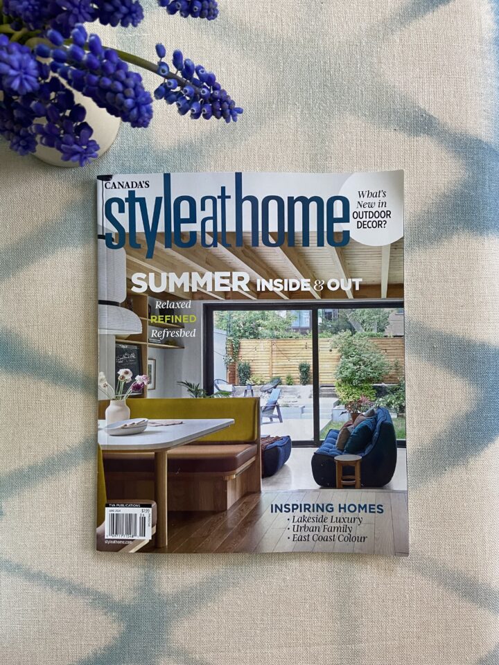
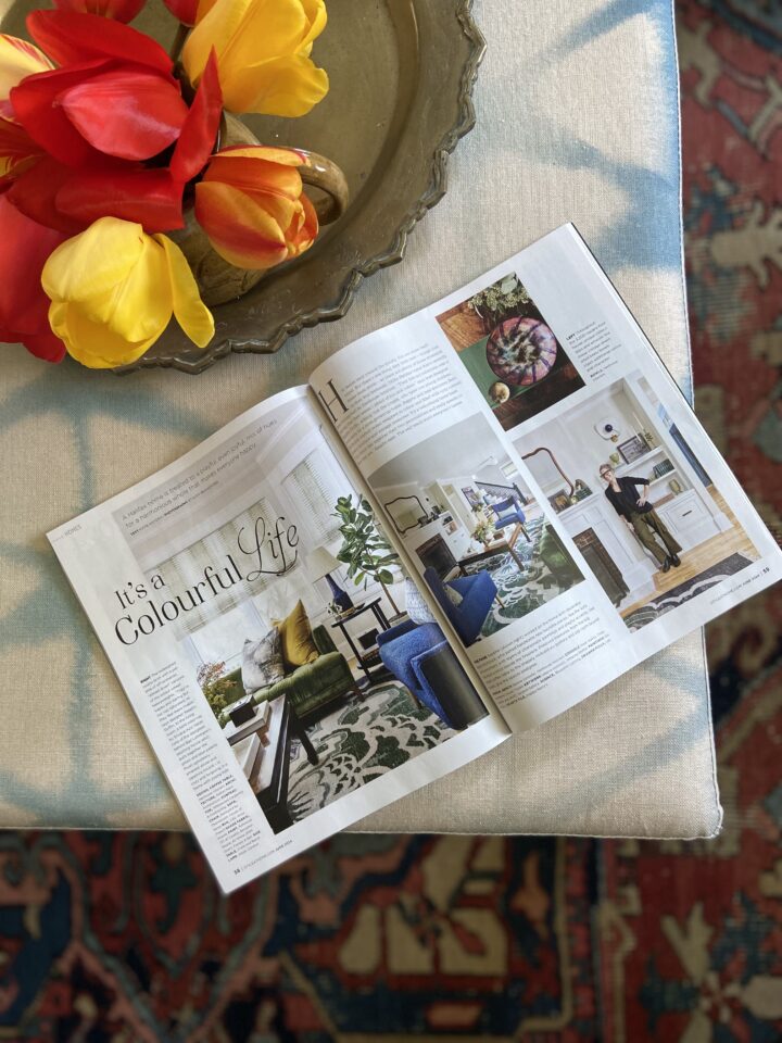
First, in the “Hot Off the Presses” department, we’re so pleased that our clients’ playful and multi-hued home has been published in the June issue of Style at Home magazine. As you may have noticed on Instagram, we had great fun shooting this house last fall. Do pick up a copy on a newsstand near you to learn how Sappho turned this charming (but dated) 1920s house into a welcoming, modern home for a young family.
We think this quote from Sappho in the article says it best: “People who’ve walked by at night tell my clients later, ‘Oh, I love your house!’ That just makes me happy: they’ve got something truly unique.”
Fresh Colour Combos
At Henhouse, we spend a lot of time thinking about colour—when to use it, how to use it, and what to mix it with. We’re drawn to unexpected pairings that may not be obvious at first glance. We love to think outside the box, if we do say so ourselves!
Here are three fresh summer palettes from one of our recent projects, and some accompanying mood boards to show you how we start pulling these concepts together. If you’re not ready to commit to a full-scale room with any of these combos, there are plenty of way to infuse these accents into a neutral space through wallpaper, cushions, art, or rugs.
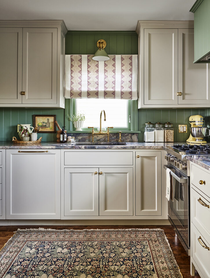
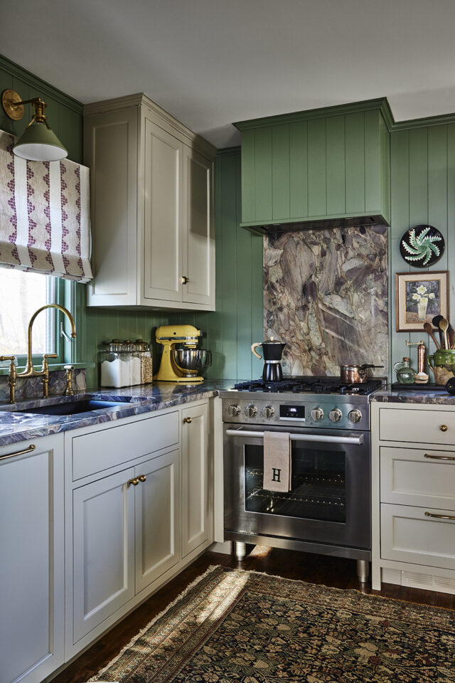
Combo 1: Purple & Green
Picture a bouquet of lilacs: those deep greens and range of purples are what everyone craves as the weather gets warmer. In this kitchen renovation, we’d already chosen Calke Green by Farrow & Ball for the tongue-and-groove walls and stylized smokey purple stripes for the roman shades. It felt like a fearless combo we hadn’t seen in a kitchen before. The cherry on top was the stunning slab of quartzite that pulled in the purple tones, along with pinks and charcoals. The result: A kitchen that’s cozy and charming, and anything but cookie-cutter.

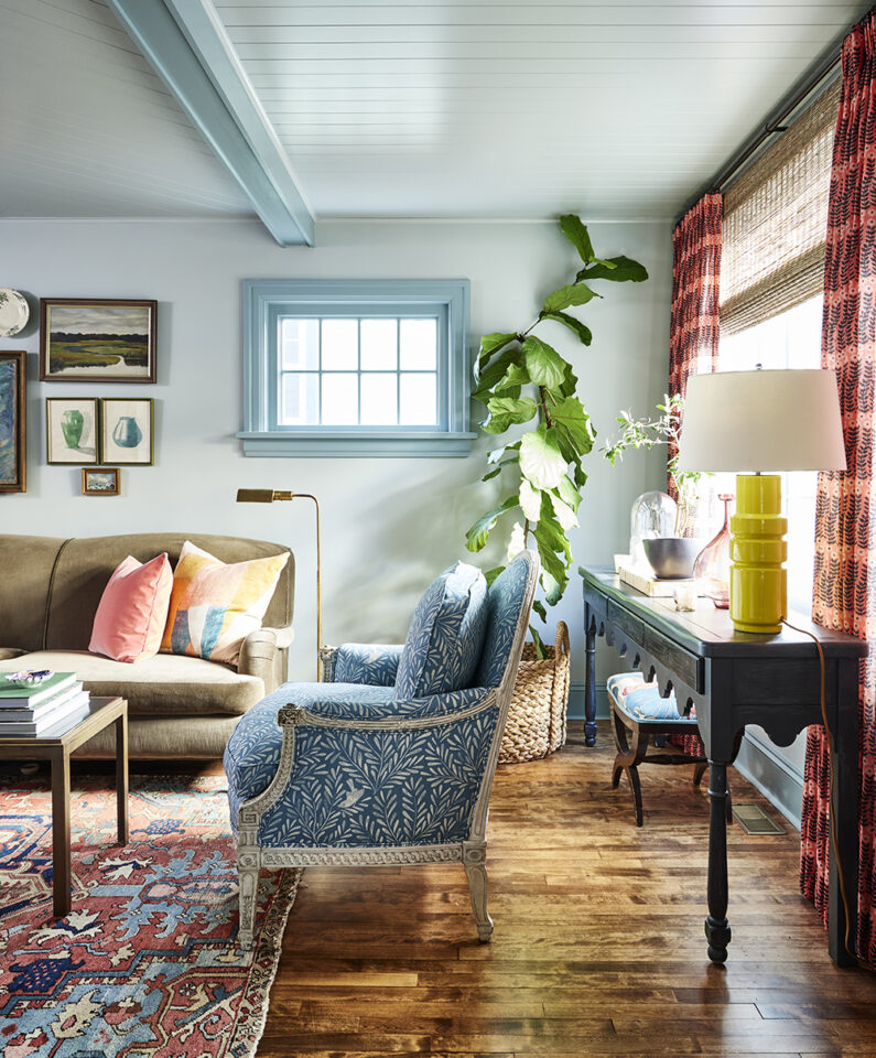
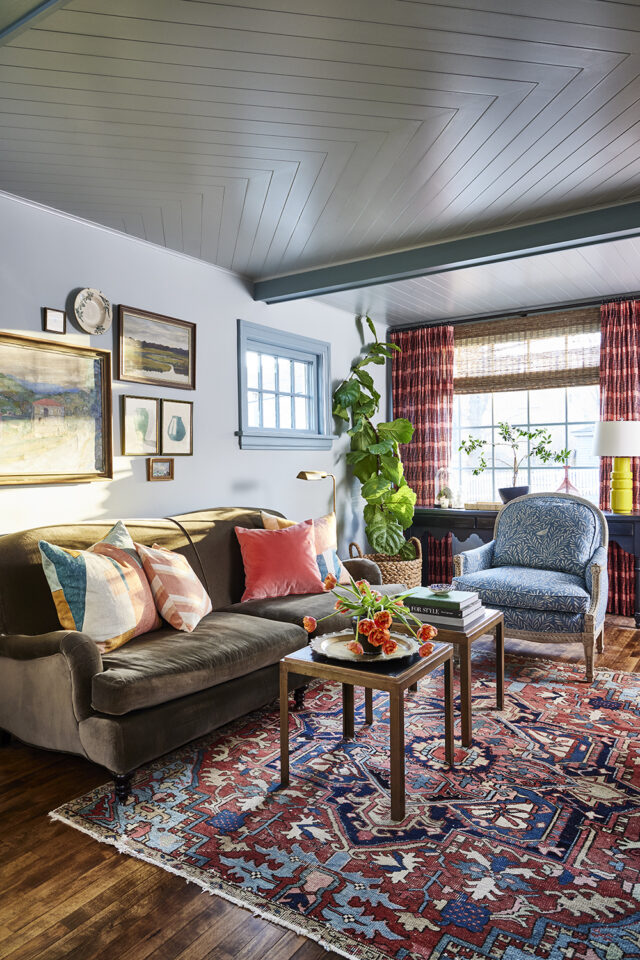
Combo 2: Blue & Coral
Fresh, fun and easy to live with, this warm/cool combo makes any room feel happier. For this living room, we started with the vintage rug and worked our way up, adding super-bright coral drapes and a pale blue paint colour on the walls with a slighter deeper tone on the ceiling beams and trim. The finishing touch was the antique French armchair we reupholstered in a modern print.

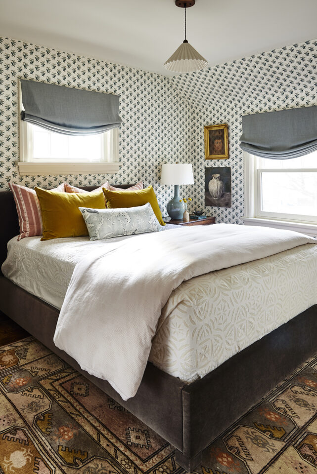
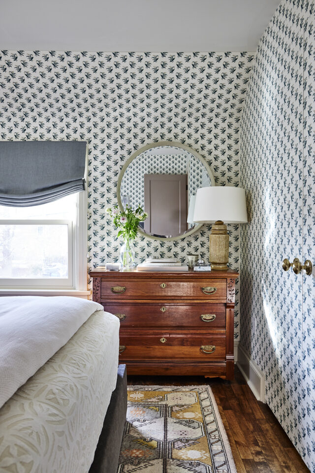
Combo 3: Pink & Ochre
Again taking our cues from a vintage rug (are you seeing a theme here?), we pulled dusty berry tones and saturated ochre up onto the bedding through a mix of linen and velvet cushions. When working with two warm colours, it’s best to throw in a cool-toned contrast, such as the seafoam romans or the light neutral ground of the wallpaper. This is a joyful combo that we love for bedrooms, kitchens, hallways or even a bathroom (yes, really).

If any of these colour combos speak to you—or you’d like us to create a custom palette suited to your home—don’t hesitate to get in touch with the Henhouse team. Here’s to fresh style for spring and summer!