Kitchen and bath renovations are among the biggest and most personal. And if budget allows, it often makes sense to tackle both at once—tilers, plumbers, electricians, and millwork installers are already on site, after all. So, this month we thought we’d share a recently completed project that just might inspire your own kitchen and bath reno plans, whether you’re ready to jump in soon or dreaming of the future.
Our clients, a professional couple with a young child in Halifax’s Fairmount neighbourhood, love to cook and wanted a bright, fresh, and functional space in which to host friends and family. They also needed an updated primary ensuite to help them navigate their busy day-to-day.
“I’d already worked on this couple’s living room, so the kitchen and ensuite were really a continuation of their aesthetic,” says Sappho. “Our inspiration was a natural palette with soft putty colours, rich wood tones, and some hits of green that speak to the mature trees in the ravine outside the home.”
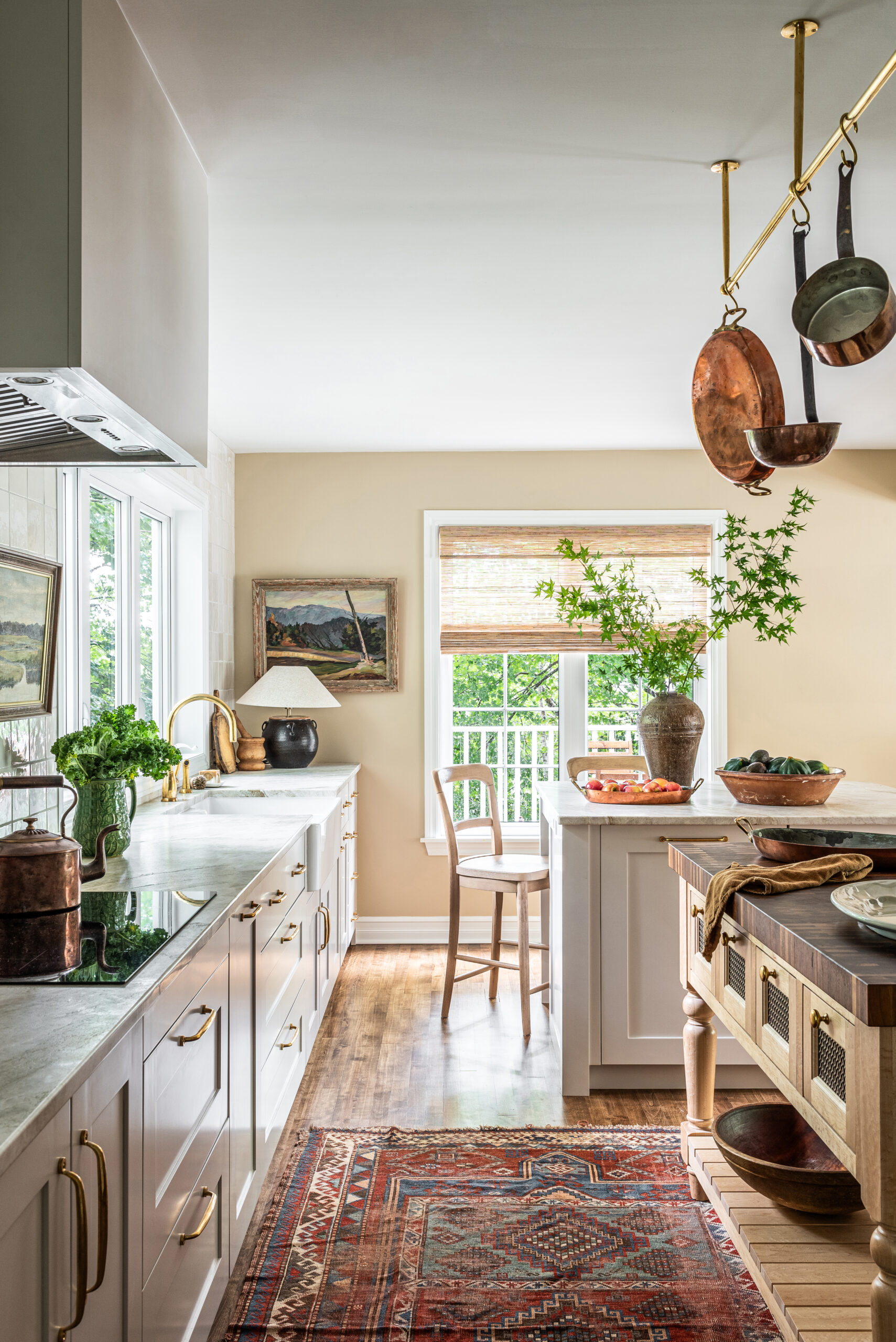
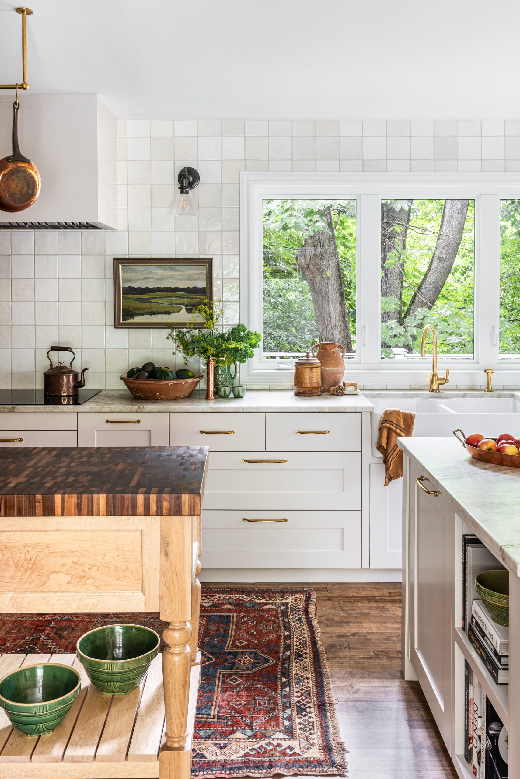
Sappho started by determining the best possible layout. The kitchen is long and well-lit, with an abundance of windows. Her solution was to divide the space visually with not one, but two islands: a wooden worktable with a butcher-block top and a more traditional closed island to incorporate storage and seating. The surprise twist? She oriented them in opposite directions to make the kitchen appear less narrow. A ceiling-mounted brass pot rack is both pretty and practical, and gives the space that “cook’s kitchen” vibe our clients craved.
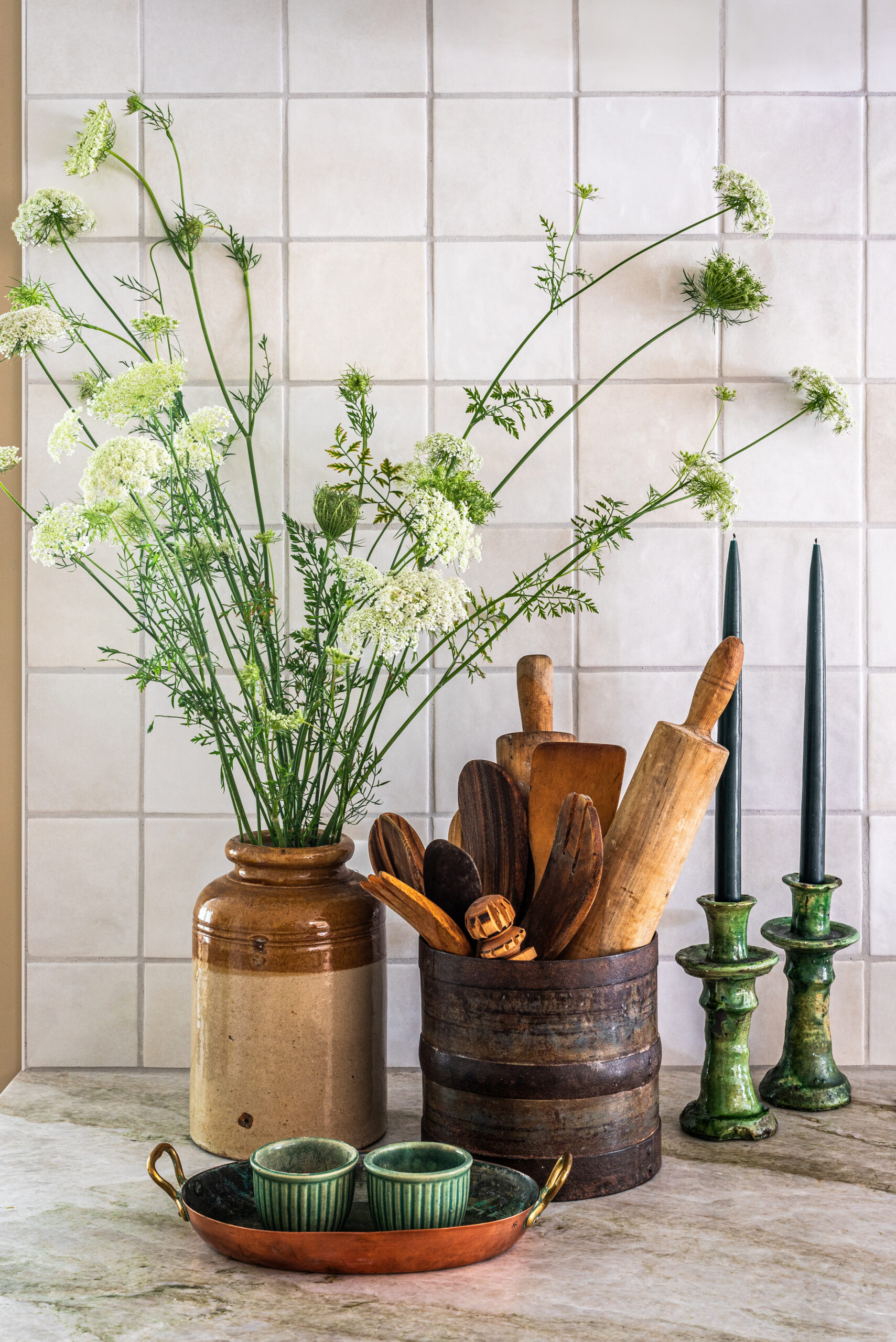
Above the longest cabinet run, which includes the range, we installed a wall of artisan-look tiles in varying shades of white and cream. Their texture and imperfections give the new space soul, which is one of our primary goals with any renovation.
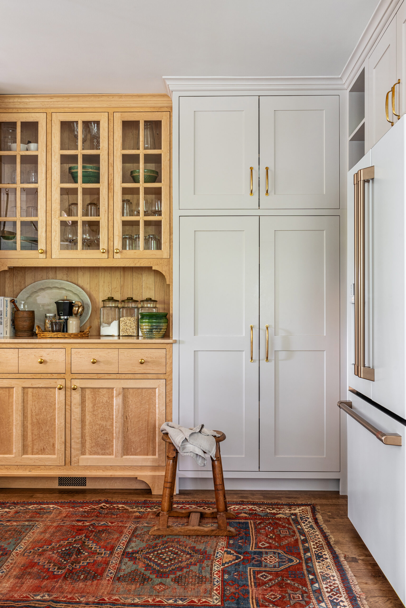
Sappho also designed the bird’s eye maple island (with walnut butcher-block top) and hutch to look like furniture pieces. “The owner didn’t want a kitchen-kitchen, that’s why you don’t see a lot of upper cabinets,” she says. “Instead, I designed a section of maple cabinets with glass-fronted uppers to sit within a bank of painted cabinetry. It gave her the look of a freestanding, vintage hutch while still being fully built-in.”
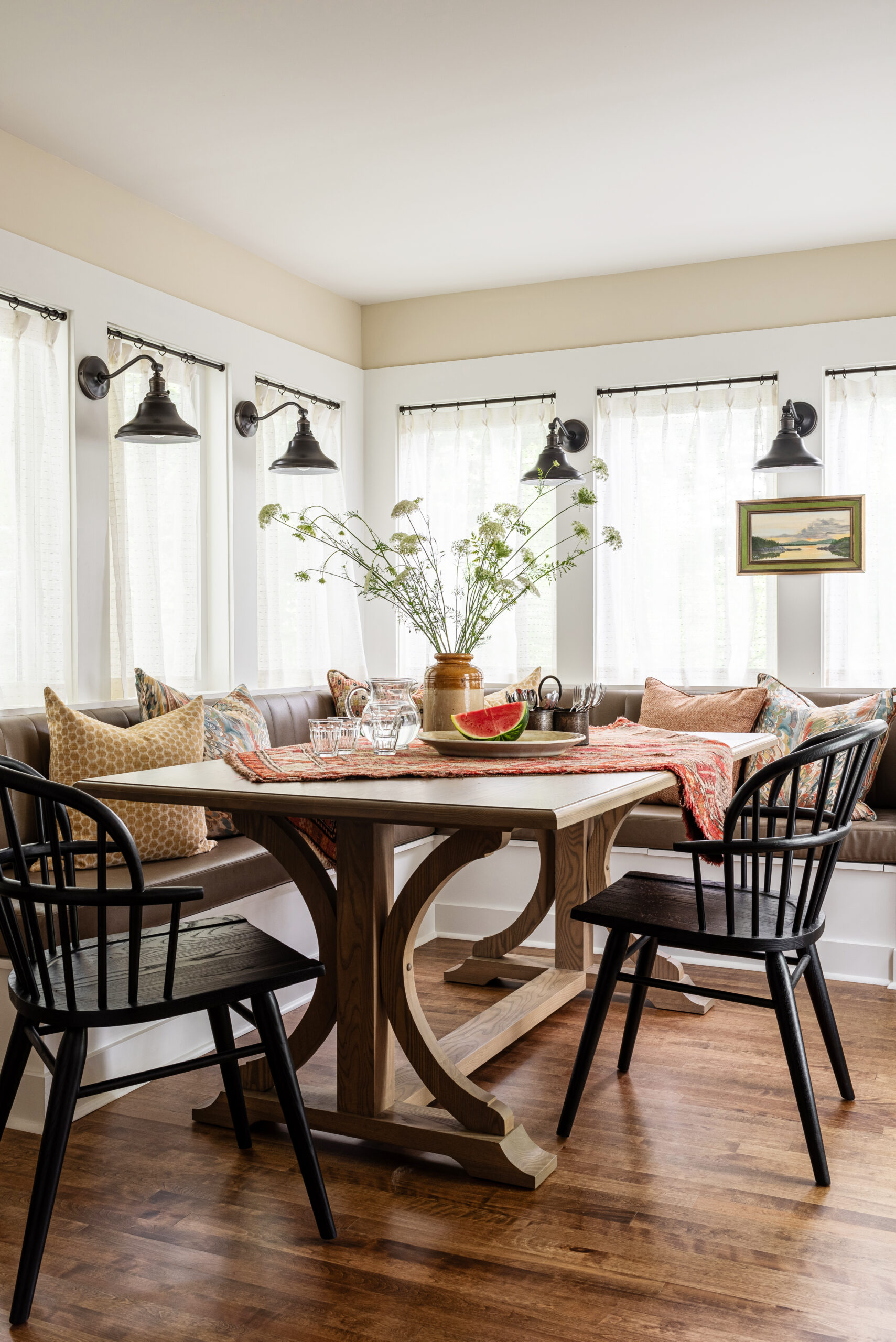
The floorplan didn’t allow for a formal dining room—and our clients didn’t feel the need for one—so Sappho transformed a sunroom into a dining nook that can comfortably seat up to eight people. Faux-leather upholstery on the bench cushions means that spills are never a concern when family or friends with children visit. The table is a custom piece modelled after a photo the homeowner pulled from her inspiration files. “We were able to approach a talented local craftsman to give us that same style, but made to suit our needs, size-wise and stain-wise,” says Sappho.
A row of sconces help to define and anchor this space, as do the sheer curtains and painting, which is mounted on the window frame for an unexpected decorative touch.
Upstairs, the primary ensuite presented a second layout challenge in the form of another long, narrow room. Sappho subdivided it into two clear spaces with a vertical glass half-wall. Behind it, at the end of the room, a dreamy soaker tub sits against mossy green tiles set in a herringbone pattern that start on the floor and wrap all the way up the ceiling.
“It was important to make that wall beautiful because it’s the main focal point, and you can also see it from their bedroom,” says Sappho. “I felt it was important to define the shower area by transitioning to square tiles in the same colour so that zone became a room within a room.” The final result is a serene space, complete with multiple shower heads for a spa-like experience.
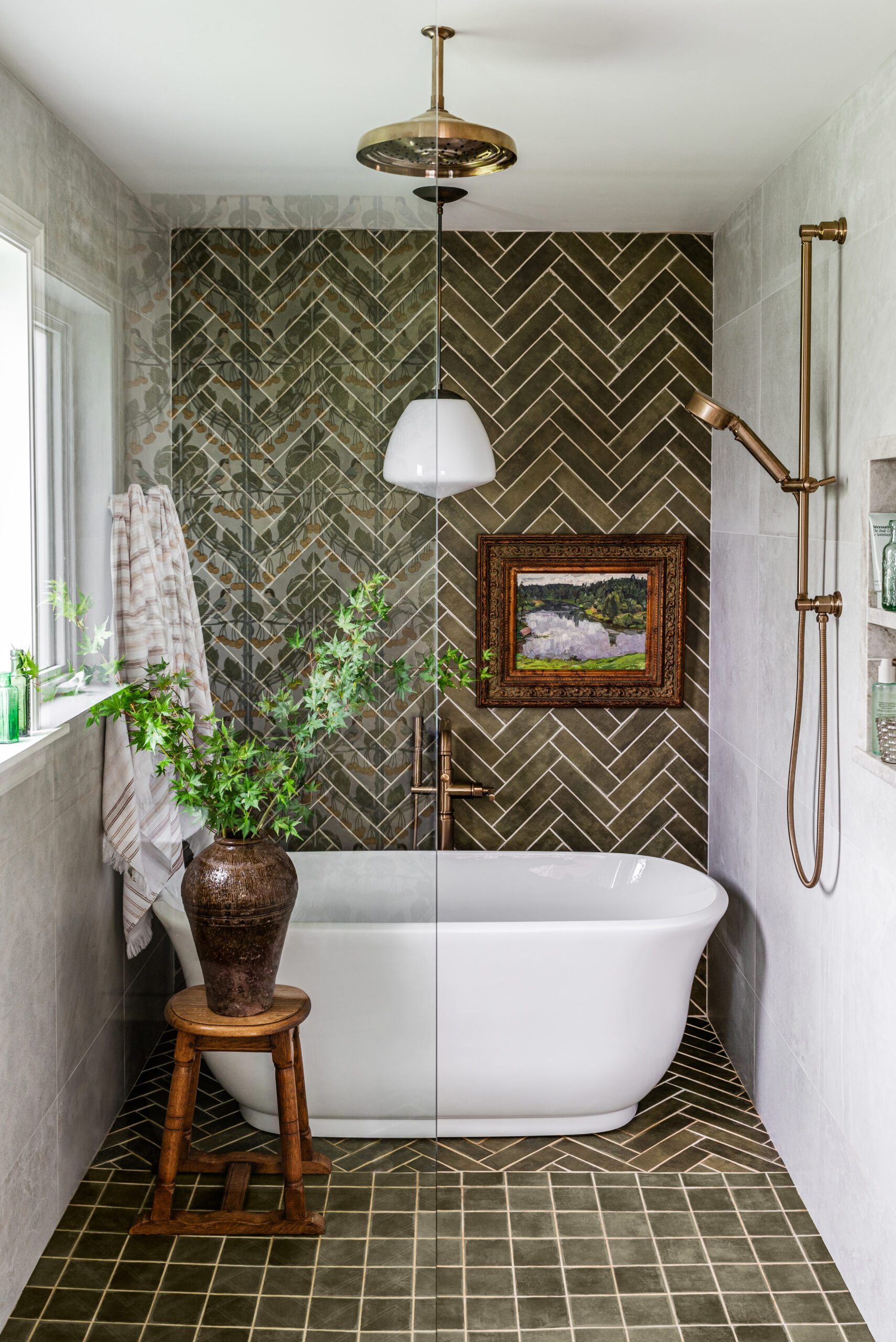
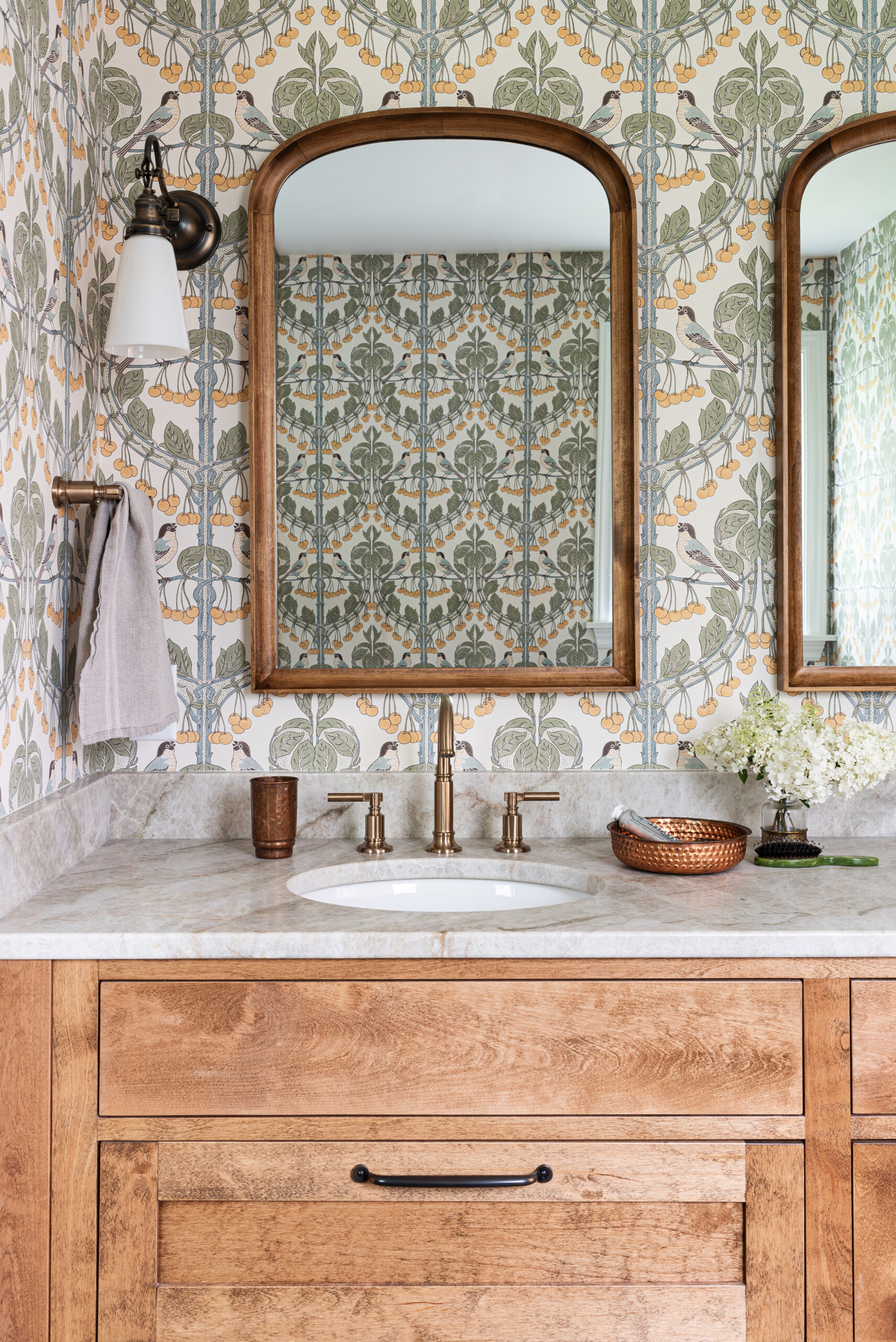
In the vanity area, wallpaper with a fun print of birds and fruit complement the green tile and introduce a warm yellow tone. In keeping with the design direction for the kitchen, the natural wood vanity feels like a piece of furniture and even the aged brass sconces feel more decorative than the average bath light.
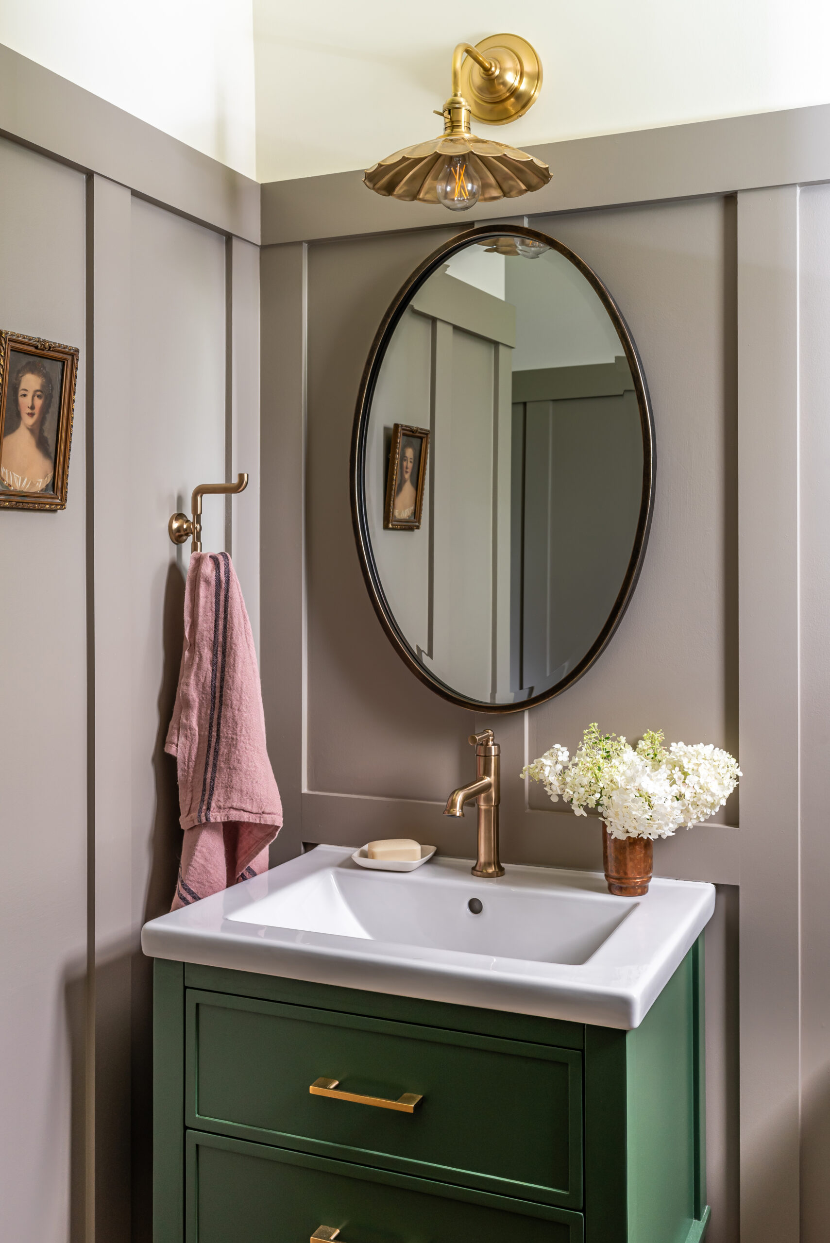
During the renovation, the homeowners and Sappho decided to add a last-minute refresh of the powder room to the to-do list. (As we said above, maximize the opportunities when all your trades are lined up and on site!) “We added visual interest by installing wainscotting three-quarters of the way up the wall,” says Sappho. “A warm brown-grey colour introduces drama, but the wall above is still light to balance the overall effect.”
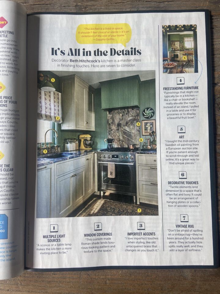
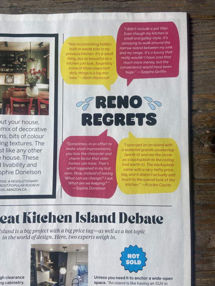
We hope you enjoyed the tour and found some ideas for your own inspiration files! If you’re contemplating a kitchen or bathroom renovation, please do get in touch with the Henhouse team. In the meantime, if you’d like to read more of our best kitchen-renovation advice, please check out the Fall issue of Chatelaine magazine, on newsstands now—both Sappho and our Senior Decorator & Stylist, Beth Hitchcock, share tips on everything from finances to finishing touches.
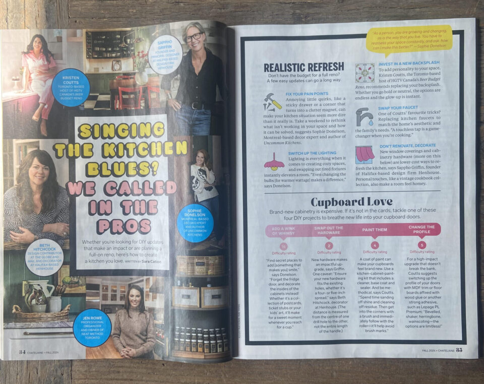
Check out our expert tips in the Fall Kitchens issue of Chatelaine magazine!