First things first: Happy Holidays from all of us at Henhouse! We hope this year-end update finds you well, and ready to spend some much-deserved downtime with family and friends.
2023 was busy and rewarding for the Henhouse team. We made massive progress on our first full build with Blueprint Construction, we welcomed a new team member, and we did six photoshoots in two-and-a-half weeks, phew! (More on that later.)
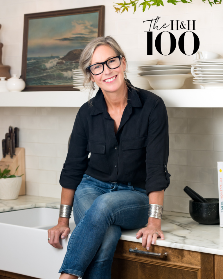
And talk about capping off the year on a high note—in November, Henhouse was included in House & Home magazine’s inaugural list of the Top 100 Designers in Canada. “It was such a pleasant surprise,” says Sappho. “Having my own home featured in last June’s ‘Advice Issue’ was a thrill, and it’s a pleasure to help represent our Atlantic clientele and the thriving Nova Scotia design scene in this collection of cross-country talent.”
Photoshoot Sneak Peek
“It Takes a Village”—that saying definitely applies to the two-and-a-half weeks (and the months prior) we spent in late November and early December. With all hands on deck, we filled our storage unit with one-of-a-kind finds, loaded cars to the brim, picked up plants and flowers, and layered our clients’ homes to get them photoshoot-ready.
We can’t wait to share the polished images with you in the coming months. But in the meantime, we thought it’d be fun to let you in on some of the behind-the-scenes chaos and creativity that goes into getting the perfect shot.
Meet Erika Higgins
In case you haven’t already encountered our intrepid and über-organized new Design Assistant & Operations Manager, we’re pleased to introduce you to Erika Higgins. True story: Henhouse has been inspiring Erika since before she took on the role earlier this year. It wasn’t until she saw the job posting that she realized her “Ideal Kitchen” image on Pinterest belonged to Henhouse founder Sappho Griffin.
Erika’s passion for design, extensive experience in administration and operations management, eye for detail, and finesse with customer service have made her a perfect fit. “I’m so thrilled to be part of this dynamic, female-led organization,” she says, adding that she looks forward to interacting with even more of our wonderful clients in the new year.

Colour Confidence
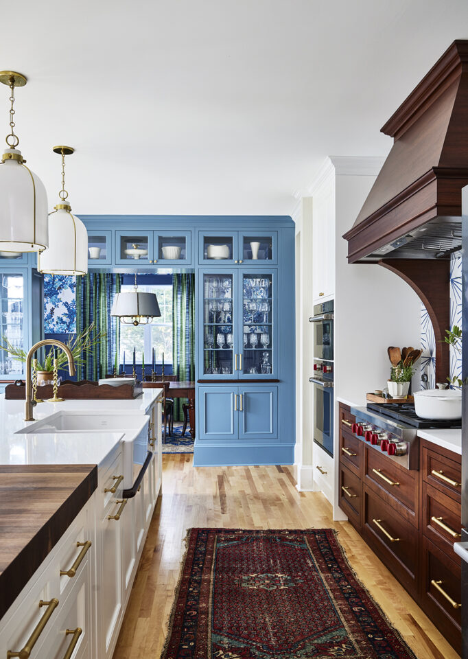
Reflecting back on the year, we realized how much we’re craving—and calling on—rich, saturated colours to bring soul and personality to our designs. Whether it’s in the form of paint, wallpaper, rugs, or even art, colour is what sets a home apart and makes it intimately, uniquely yours. Here’s what colour each team member is crushing on lately:
Sappho Griffin, Ochre
Why I love it: It started with a summer dress. After many years of avoiding the idea of wearing yellow, let alone incorporating it in my design work, I was suddenly smitten. This yellow dress caught my eye because it was deep and saturated; a yellow with depth. It felt like a sophisticated new colour to try out.
How I’d use it: In a recent client’s home, I installed earthy yellow tiles in the laundry area, burnt-umber wallpaper in the bedroom, and cushions in the entry. In another, I painted all the living room trim in India Yellow by Farrow & Ball, which looks amazing above refinished hardwood floors in a deep chestnut stain.
What I’d pair it with: Other earthy colours like deep plum, mossy green, and warm brown.

Christine Buiteman, Navy
Why I love it: I normally gravitate to earthy, muddy palettes, but this year I had a chance to delve into some deeper jewel tones, especially blues. Deep blues are often pigeonholed into coastal-inspired designs, but they have sophistication when used thoughtfully.
How I’d use it: I recently decorated a West End home, and the lone pop of colour was Benjamin Moore’s classic and timeless Hale Navy on the entry cabinetry and in the powder room. My blue crush also found its way into another project, where two blue sofas anchor the seating area and we converted a 1940s-era coal-burning fireplace into a functioning propane one, clad in glossy blue tile.
What I’d pair it with: For me, rich navy shines beside softer blues, earthy greens, and fresh tones of raspberry.

Beth Hitchcock, Olive
Why I love it: Warm greens are calming and timeless—maybe we have Mother Nature to thank? Lately, I was struck by the way the British Kitchen company deVOL really went for it in their new showroom in Bath (which I’m hoping to visit over the holidays), drenching the cabinets, walls, and trim in the same olive-y shade. So chic!
How I’d use it: We’ve seen a lot of kitchens with green cabinetry in the last couple of years. (Are green kitchens the new blue kitchens?) In my own home, I decided to flip the script and use Farrow & Ball’s Calke Green on the tongue-and-groove walls to act as a rich backdrop for mushroom-coloured cabinets.
What I’d pair it with: Olive loves to hang out with almost anything from pink to mustard, and it thrives in the presence of brass and wood. In my kitchen, I matched it up with pale, smoky purples in the window treatments and quartzite countertop. It sounds like an unlikely duo, but green and purple are friends on the classic colour wheel.

Erika Higgins, Dark Chocolate
Why I love it: I first spied Wenge by Benjamin Moore on an Instagram post where it was used on wainscotting and totally fell in love. This shade is the perfect violet-based brown, and it feels dramatic yet cozy and warm.
How I’d use it: I would love to see this colour in a den with a fireplace and a lot of rich textures and antiques mixed in. Just imagine curling up with a book—and maybe even an Old Fashioned—while enveloped by this colour!
What I’d pair it with: I would pair dark chocolate with a complementary vintage rug and some gold-framed artwork to add some brightness.

Parting Thoughts
A heartfelt thank you to all our current clients, past clients, and design-loving friends for your support. We are now accepting new work for the coming year, so please don’t hesitate to get in touch if you or someone you know has a project in mind. Together, we’ll make 2024 even more stylish!
Once again, Happy Holidays to you and yours from Sappho, Christine, Beth and Erika.


